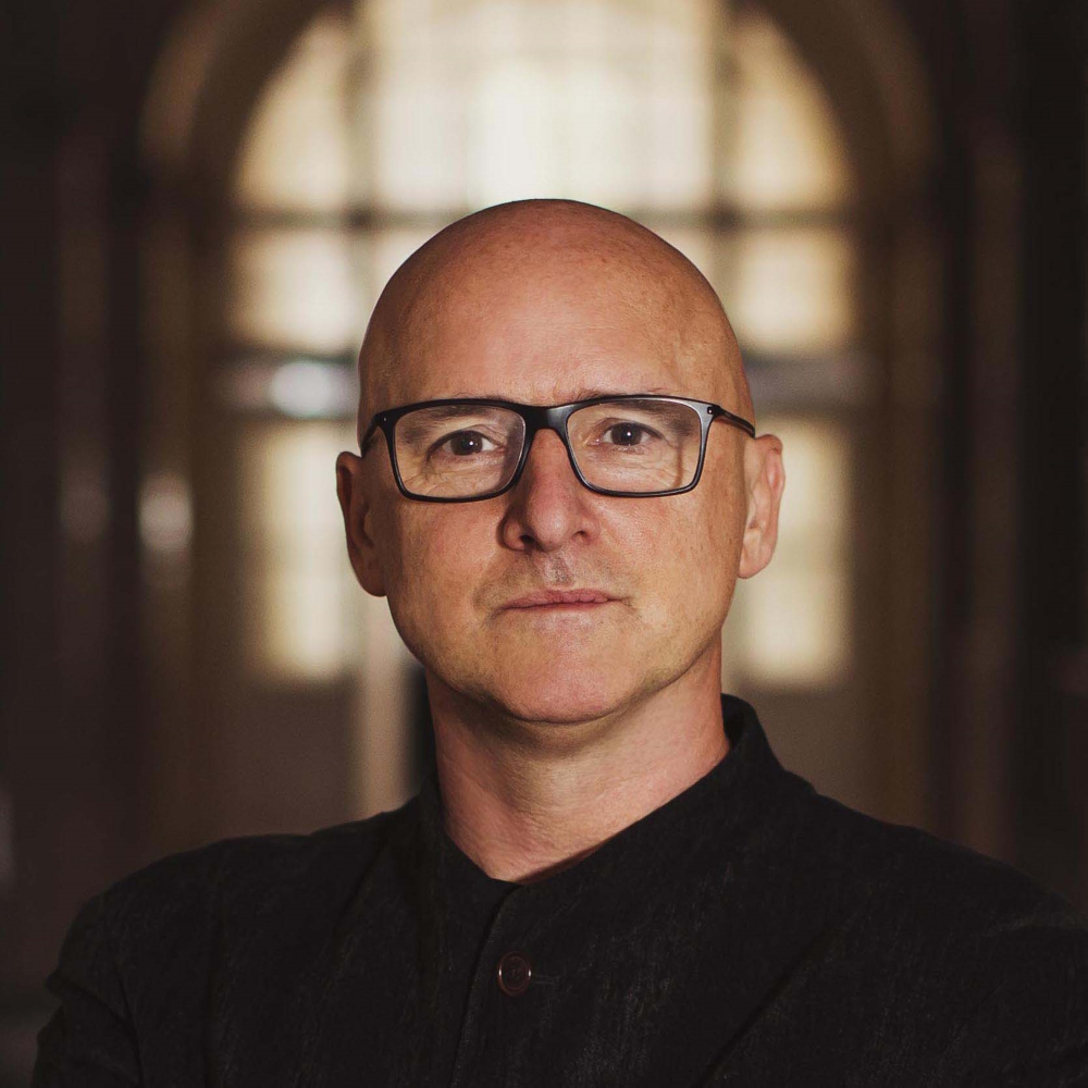
Kevin Shaw
founder & creative director of leading packaging design agency
UK / US
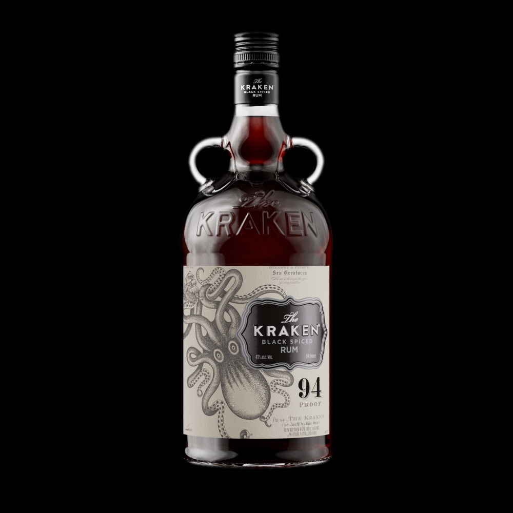
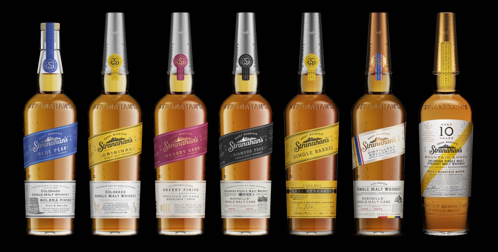
Beefeater. Jack Daniels. Dewar‘s (part of Barcardi Limited). Martini. Just four of the 7.000 projects Stranger & Stranger has worked on during the first quarter century of its existence. "The award-winning alcoholic beverage brand and packaging design agency has studios in London, New York and San Francisco", writes Decanter.com. "The company advises businesses and start-ups of all sizes, and is behind some of the most prominent labels launched in the past 20 years, including Treasury Wine Estates 19 Crimes and The Kraken Black Spiced Rum. Considering the long list of successes and top references the firm has had "in one of the toughest sectors in the whole of retail”, according to its founder, it not surprisingly claims on the homepage a self-assured "we’re the best!” Understandably also that its slogan is a registered trademark too: "Don’t fit in, stand out!"
Kevin Shaw
founder & creative director of leading packaging design agency
UK / US
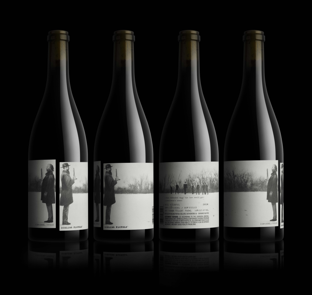
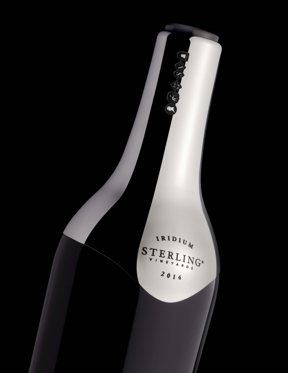
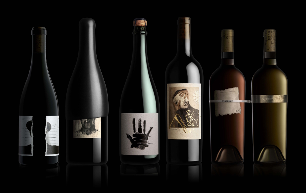
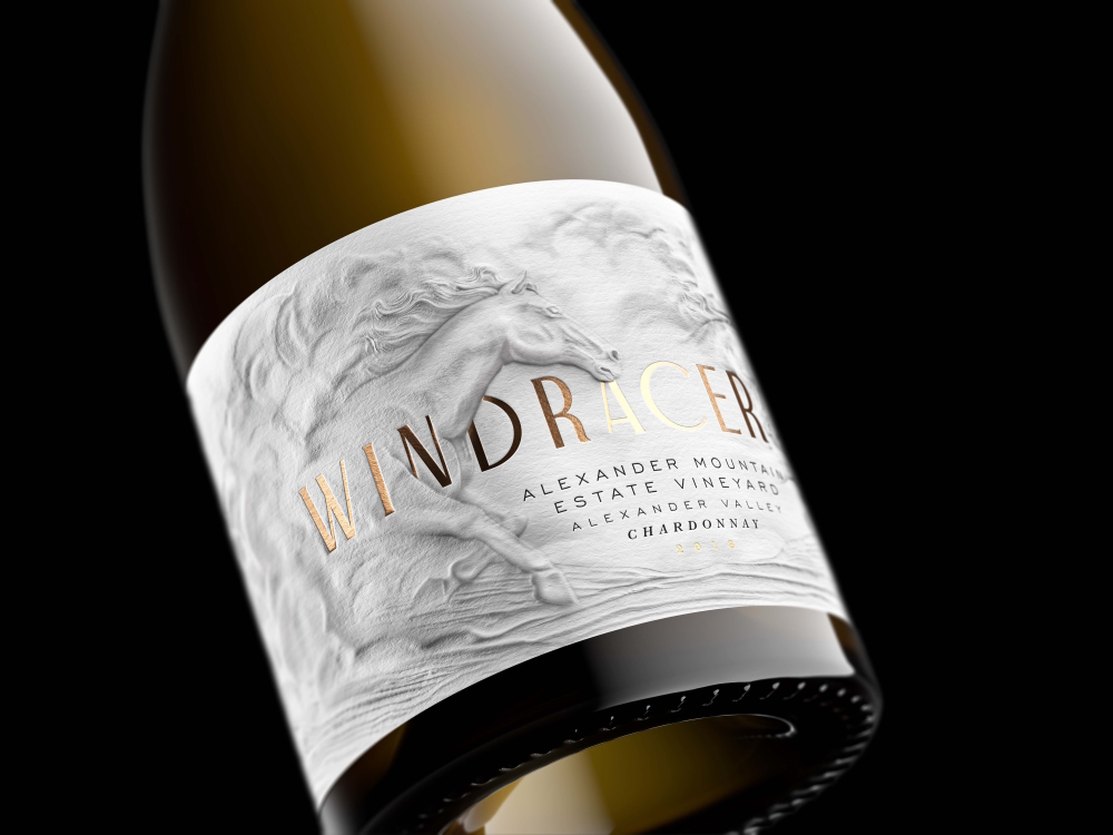
"There are 6000 California Pinot Noirs to choose from", Kevin Shaw told eyemagazine.com. "To the average consumer they all taste pretty much the same and they come in the same shaped bottle. They all have the same innocuous copy on the back label and, although some are ten times more expensive than others, you can’t taste the product before you buy it to know if there’s any real difference. We have to make people pick up a bottle without tasting it, in a sea of competition and often at a price premium. And there is only one visible means of communicating a wine’s character – the label." Noticing this specific visual opportunity was actually what got him into the beverage-packing-business. At a wine auction a friend pointed it out to him that the labels on all the bottles don’t look great – the rest is history as the glass containers that Kevin Shaw and his team create and illustrate can’t be ignored anymore - they stand out on the shelves in the truest sense of the word. And that’s not all: an additional side-effect of this enticing packaging is that consumers like to collect or even sell the empty bottles.
Kevin Shaw studied graphic design at London‘s University of Westminster up until 1984. He was Creative Director at D4 Design in London before he formed Stranger & Stranger in 1994 but his first job as a designer was at The Fine White Line, the design floor of London advertising agency Collett Dickenson Pearce. The agency was, according Wikipedia, "a nursery for a number of British creative entrepreneurs who would later enjoy famed careers" - people like Kevin Shaw.
Mr. Shaw named the company that way because he was freelancing after work (moonlighting) with a friend at the time - moonlight projects were called “strangers" in the studio - so Stranger & Stranger was born.
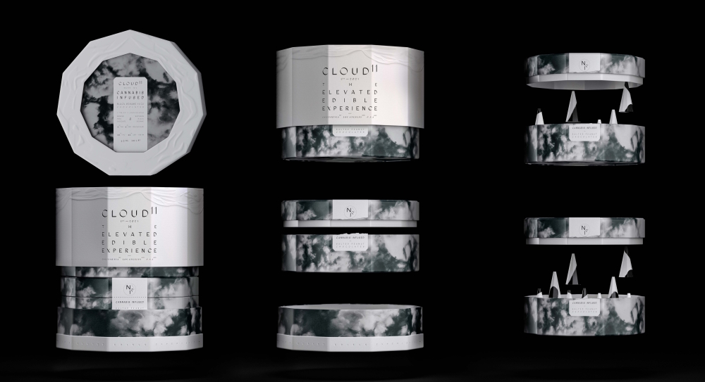
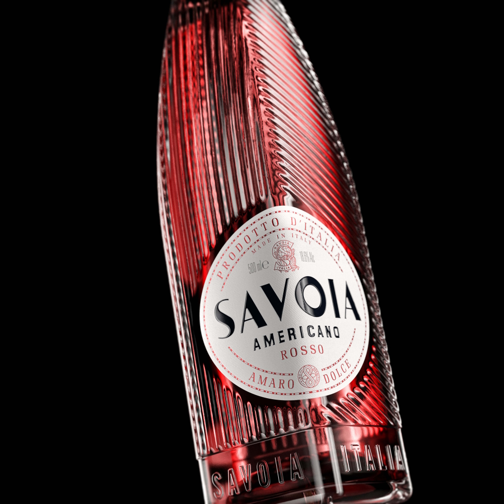
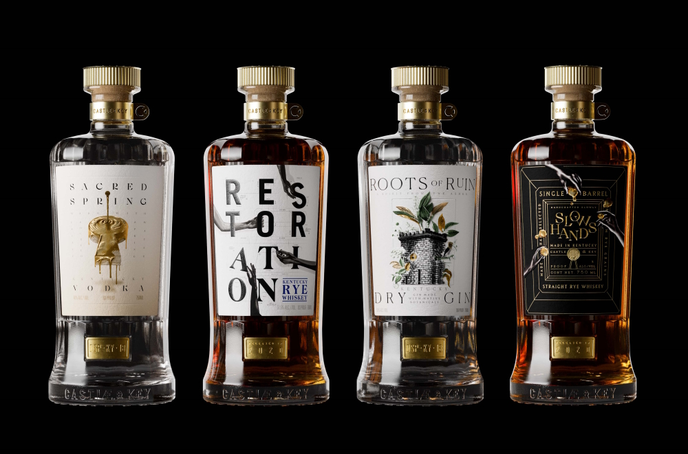
These times are long gone. His firm is well-known for decades as it is one of the world’s top Design Agencies! The key to its success is the fact that this one is not like its competitors. "Stranger‘s designers tell a story through the packaging", notices commarts.com, "engaging the consumer on an emotional level, even if it’s only through small visual cues. This goes back to Shaw’s earliest days of concocting wine labels. He revolutionized wine packaging by introducing design practices established in the world of fast-moving consumer goods (FMCGs) that simplify and clarify the label for consumers. Although the packaging styles vary hugely with intriguing illustrations, lush typography and fanciful compositions that seem fresh on each glance”.
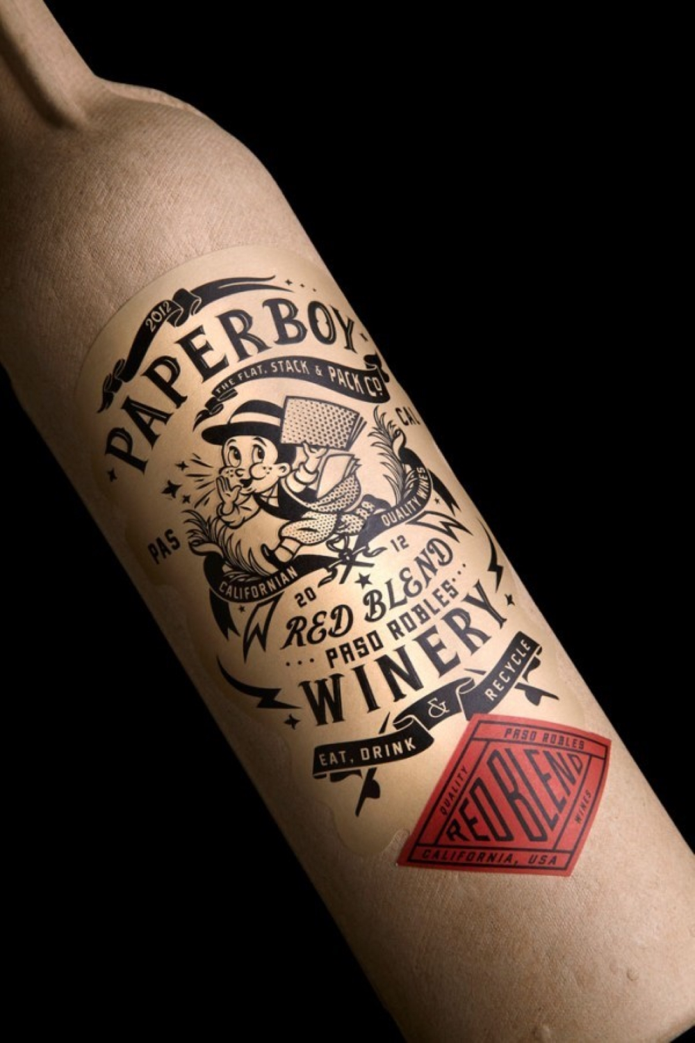
Stranger & Stranger constantly pushes for more innovation – like the first paper wine bottle (for sale in the US only)! Because it‘s made from recycled paper it is so much lighter than glass bottles. This means that twice as much can fit on trucks and the energy saving is almost 85%! Stranger & Stranger doesn’t limit itself to alcohol packaging but expands into other areas of luxury packaging like expensive gifts, fine foods, perfume and cosmetics. Whatever the product might be, Kevin Shaw will urge convincing the clients of his credo that he mentioned in an interview with harpers.co.uk.: "Don’t be afraid to be different. Try and create brands that stand for something.”
Kevin Shaw, who likes drinking California Pinot Noir and good whiskies, lives in Sonoma (California) wine country.
Interview January 2023
Telling stories with packaging: „Don’t fit in, stand out!“
INTUITION/IMAGINATION
How does intuition present itself to you – in form of a suspicious impression, a spontaneous visualisation or whatever - maybe in dreams?
I think the subconscious does a lot of work for you if you let it. We’ve all seen bottles in dreams, sure, and we’ve had ideas just chatting about the brief. The important thing, always, is to be very clear and concise about the problem to be solved before you submit it to your subconscious. One of my heroes is a New York designer called Bob Gill, he wrote a design book called “Forget all the rules you ever learned about graphic design. Including the ones in this book" (1981, Watson-Guptill Publications) which basically left me with the idea that if the brief doesn’t click then you should rewrite the brief. He wrote one sentence briefs, it’s a practice we still do in the studio today, and it really clarifies the ask for the designer and the client.
Will any ideas be written down immediately and archived?
We get projects in all the time that we think we might already have ideas for. We try not to let any good ideas go to waste.
?: How do you come up with good or extraordinary ideas?
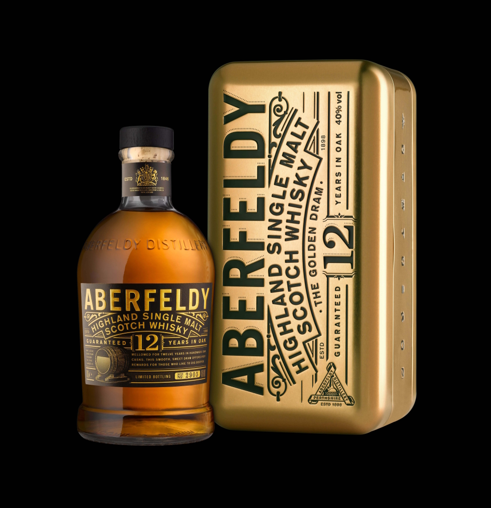
For us everything starts with the client‘s story. We probe and dig until we get a story that is appealing and hopefully unique and then find a way to tell it that stands out from the other brands on the shelves around it. We redesigned a scotch called Aberfeldy - it used to have a squirrel on the label but no one knew why and, well, anyone can claim a local squirrel as a brand asset - and after some research we found that the spring water they used to make the whiskey contained traces of gold. Locals used to pan for it. Now that is a unique selling point so The Golden Dram became the strategy which informed the packaging and all communications and everything designed itself.
?: Do you feel that new creative ideas come as a whole or do you get like a little seed of inspiration that evolves into something else and has to be realized by endless trials and errors in form of constant developments up until the final result?
An idea can come to you in a second but the crafting of the idea, and we pride ourselves on crafting, is what makes the idea sing and that takes time. A poorly executed idea is just as bad as superficial nonsense.
What if there is a deadline, but no intuition? Does the first fuel the latter maybe?
You can’t miss a deadline or disappoint a client so you have to find ways of coming up with good ideas on the spot. Every experienced designer has their tricks, some designers even work best under pressure close to the deadline. I guess the adrenaline helps.
INSPIRATION
What inspires you and how do you stimulate this special form of imaginativeness?
The best inspiration comes from a great relationship with a client. We’ve been really lucky over the years to have clients who are really open to creativity and commit to making new things happen. And when they do we love them forever, go that extra mile for them, and they inspire us to push the creativity even more.
?: How do you filter between ideas worthwhile pursuing and bad ones that you just let go of?
It’s more a matter of which idea will work the best, which will sell more bottles, and those decisions come from experience. We’ve been doing this a long time and we know what doesn’t work.
Has it to appeal to you primarily or is its commercial potential an essential factor?
We’re a packaging firm, we live and die by our ability to make people buy our clients‘ product and if we failed in that task we’d be fired. And quite rightly. Awards are nice but at the end of the day commercial sales keep our clients going and they pay the designers salaries. The trick, the really hard work, comes in creating something that will sell and is very creative too.
Do you revisit old ideas or check what colleagues/competitors are up to at times?
Always. It’s vital to us to keep updated on what the market is up to: new brand launches, new flavors, new sub sectors and products. And it’s important to do any tweaks that might be needed to keep our clients‘ brands relevant.
CREATIVITY
What is better in the realization process: speed and force creativity i.e. grasp the magic of the moment, or a slow, ripening process for implementation/elaboration?
The idea usually comes quickly, it almost goes hand in hand with really understanding the problem and the constraints around the problem. The solution is often the only route though the maze so often presents itself at the same time as the redefined problem. Sitting with the idea gives one time to reflect on the best way to express the solution and that’s where the crafting comes in. That’s where the time is spent.
?: Do you have any specific strategies you use when you are feeling stuck creatively?
If anyone is stuck, and everyone gets stick sometimes, then they just need to talk to their colleagues. A fresh take or perspective on a problem is usually all it takes to unlock a solution, and may only take a few minutes. The worst thing in the world is to stare at a blank page hoping for some divine intervention. Oh, that way madness lies.
How important are self-doubt and criticism (by others) during such a process i.e. is it better to be creative on your own, only trust your own instincts, or in a team?
We don’t really work in teams, everyone has responsibility for their own projects, but no one should have self doubt. However everyone should be open to making things the best that they can be, and that includes being open to suggestions.
Should a creative always remain true to him-/herself including taking risks & going against the flow or must one, for reasons of (commercial) survival, make concessions to the demands of the market, the wishes of clients and the audience’s expectations?
Ideally all these things should become one. The client wishes to be successful, their product catches a consumers‘ eye and they buy the product, it catches the consumers‘ eye because it is different to the bland products around it, it’s different so it wins creative awards. Everyone goes home happy. The one thing that binds all these things together is trust. The client has to trust in the idea of being different. And it’s not easy because we’re creating things for the future - it takes a long time to get a product on shelf and you want the design to hold up for at least a decade before you have to evolve or update it. The most dangerous part of the whole process is in that term ‘audience expectations’. Steve Job famously said: “People don't know what they want until you show it to them. That's why I never rely on market research. Our task is to read things that aren't yet on the page.”
Innovation still has to appeal to people, it can’t just be different for difference sake, but if you ask everyone what they want you’ll end up with average.
How is innovation still possible if one has established a distinctive style and, just in case, is it good to be ahead of one’s time even one hazards not being understood?
Over 20 years ago we started pastiching Victorian styles to labels. Victorian graphics were all about craft. I’m not saying Swiss graphics aren’t crafted but, well, it’s not the same ball park. Back then everything was created on copper plates which were unforgiving - there was no undo or apple z - and only the best craftsmen survived.
The Victorian styles rise into the mainstream coincided entirely with the rise of social media. 10 dollar crafted avocado on toast, 100 dollar hand made axes, craft distilleries and all things that took a lot of time and care were grounding when life, as communicated through Facebook et al, became fast, ephemeral and throw away.
Everything is cyclical though. The Victorian thing is a bit overdone now - that style of design on our website is over 5 years old - and when there are firms still churning out that style and only that style all day long everything starts to look a bit homogenous. There’s been an upsurge in minimalism which we’ve been seeing over the past few years and it's starting to take hold in markets where it can stand out. I remember when it was here last, it’ll fizzle out and be reborn in another decade.
For us it’s still all about the brand story, and for us it’s difficult to tell a unique story on pack when you look like everyone else or when you look like a pastel colored bottle of painkillers. There are plenty of other styles to choose from.
When does the time come to end the creative process, to be content and set the final result free - or is it work-in-progress with an endless possibility of improvement?
We’ve been doing this for almost 30 years and when I look at some of our older work I know we’d do things differently if we got the chance to do them again. We have clients who need to sell stuff so everything is deadline driven and all one can hope to say about any piece of work is that it was the very best that they could do at that point in time.
?: In case of failure or - worse - a creativity crisis how do you get out of such a hole?
We’re professionals so we make sure it never happens.
SUCCESS
Should/can one resist the temptation to recycle a ‘formula’ one’s successful with?
Absolutely. Clients pay us for work they can own, work they can trademark, work that stands out from the competition, so when I see studios who use the same basic style of type and illustration on every project I think they are shortchanging their clients. That said when you create a style for a client and they create new products within the brand then it is only natural to maintain some of that style and approach for all their products.
Is it desirable to create the ultimate/timeless work, but doesn’t “top of the ladder” bring up the question of “what’s next?” i.e. isn’t such a personal peak “the end”?
You hope the solution to every brief is the best that you can do at that moment in time but times change and the environment changes. The Sex Pistols were the most shocking punk band ever - at the time - but now, if you look back on those videos, they seem pretty tame. It’s the same in design. Todays shock is tomorrow‘s meh.
MY FAVORITE WORK:
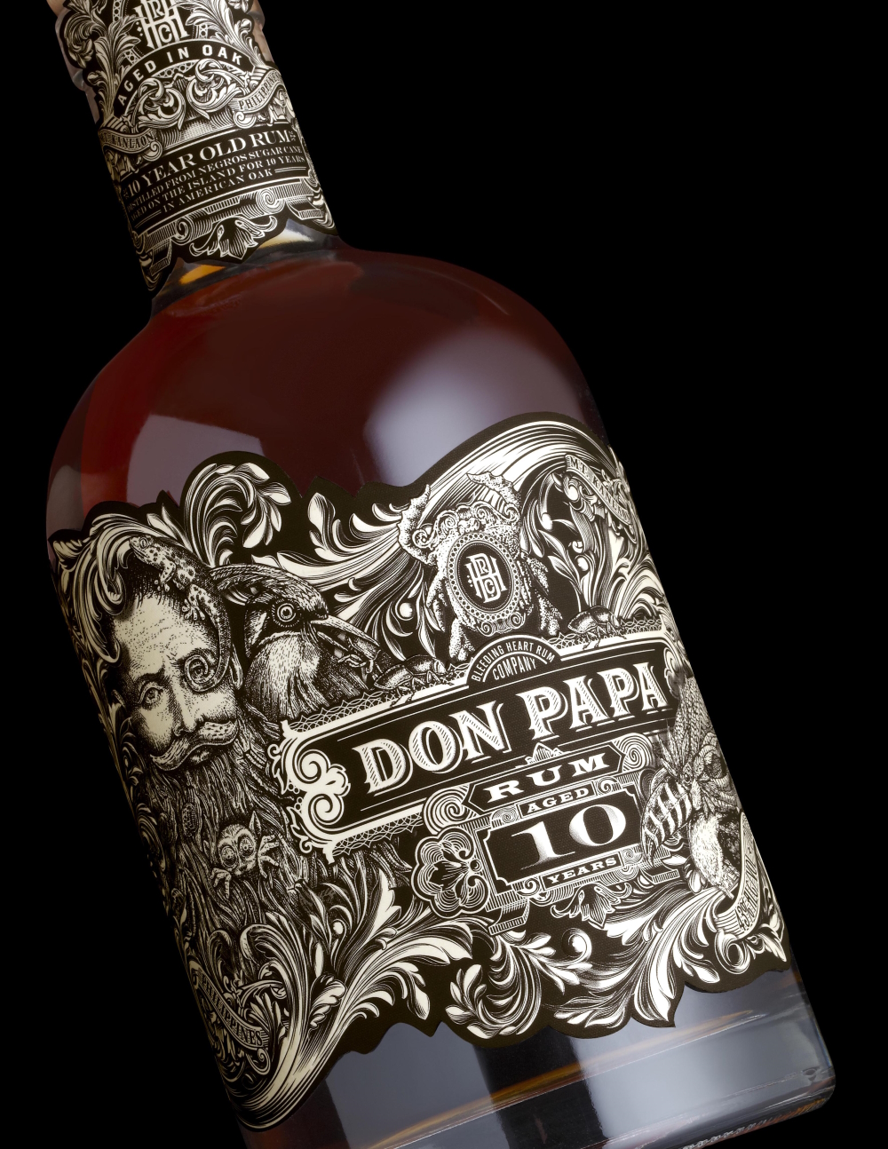
Don Papa: The client came to us with a tiny budget when he started this brand a decade ago, but he did give us a completely open brief: do what you think is best. We gave him one idea, he ran with it and he recently sold his brand to Diageo for over $200million. That’s the power of packaging.
